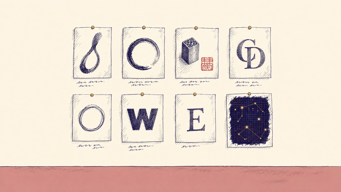
Last month I put twenty-eight logos on a wall and talked to my phone about them for twenty minutes.
Not my logos. Other people’s. Penguin’s penguin. The Faber and Faber ff. Paul Rand’s Westinghouse W. A stone seal from a Chinese calligrapher’s desk with the red paste still on it. Dürer’s monogram from 1500. A sushi restaurant’s brushmark. The OpenAI knot, on purpose, so I could say what I hated about it.
Claude Code found most of them. I added a few. Then I walked the wall out loud, and the machine wrote down every word.
One of the things I said, about the sushi mark, was: “That’s sick. It looks like a whisper of smoke.”
That sentence is now the brief for the loop in my logo. Not a paraphrase of it. The sentence. It sits in a file the machine reads before it draws anything with my name on it, and fourteen rounds of labs later, the mark on this site is the one that obeyed it.
This is the guide to how that works. I wrote about taste once before, in The Creative Unlock, and said the fix was mood boards. This is the mood board, taken apart.
The thirty-second answer
✶ The thirty-second answer
Taste is easier to sample than to describe. So I never ask myself what I want. I have the machine show me twenty or thirty real things, I react out loud, and the machine records what I said, verbatim, next to each one. Then it does the analytical work: what the loves have in common, what the hates rule out, and which two or four directions are worth testing. A lab puts five to seven complete versions of one decision side by side. I pick by looking. The reason I picked becomes a rule in the brand folder, and every draft after that obeys the rule without my having to say it again. The only thing that leaves the room is the why.
Why you cannot describe your own taste
Every creative director has dragged a client into a mood-board exercise, and every analytical person in the room has rolled their eyes. I rolled mine for years. Then I tried to explain to a machine what I wanted my brand to look like, and I understood the exercise for the first time.
I could not do it. I could say “literary,” “warm,” “a little tech.” So can everyone. Those words produce the average of the internet, which is what the machine gives you when you give it adjectives.
What I could do was look at a thing and know in a second. “That’s sick.” “Too death metal.” “I hate it. With a passion.” That reaction is the whole asset. It is fast, it is certain, and until last year it evaporated the moment I said it, because nobody was writing it down.
So the method is built around one rule: never ask me what I want. Show me things and record what I say.
The run, step by step
Every board I have built follows the same eight moves. The machine does six of them. I do two.
1. The brief. One line: what decision does this board unblock? “A visual direction for the homepage” is a brief. “A mood board” is not. If there are guardrails already, they go on the brief so nobody re-auditions them. For my logo: gold initials, a hand-inked loop floating above them like the dot on an i. That skeleton was settled. The board was about the loop’s character.
2. The hunt. Claude Code goes out and finds fifteen to thirty real candidates, deliberately across categories: direct peers, out-of-category aspirations, artists who set a ceiling, adjacent media, and deliberate opposites. That last category matters more than it sounds. Hates are half the signal, and it is much cheaper to collect them on purpose than to wait for them.
3. The intake. I drop in my own finds. Screenshots, links, a photo from a museum. Filenames do not matter. A three-word note on why helps, but no note is fine. Zero organizing on my side is a hard requirement, because any friction here and the highest-signal items never arrive. The image my entire palette was sampled from came in this way.
4. The capture. Everything gets normalized so the board compares design, not screenshot quality. Same width for every site. A note on anything whose subject is motion, because a still lies about motion.
5. The reaction. I walk the wall and talk. Loves, hates, shrugs. The machine writes it down exactly, garbles and all. When a reaction is vague it asks one narrowing question. Is it the color, the type, the layout, the feeling? One question. The board exists so I do not have to introspect.
6. The catalog. A dated file with three sections. Loves, as a table: the reference, my words, and what it contributes. Hates, as a list: my words and the rule they imply. Then the synthesis, four to six numbered findings of what the taste adds up to. The third column of the loves table is where the machine earns its keep. “It looks like a whisper of smoke” becomes “the ink character, named: tapered, breathing, atmospheric.”
7. The board. Grouped by energy, never by source. Six screenshots from the same site do not make a group. “The mark as a pressed, physical act” does, and it can hold a Chinese seal next to a book publisher’s colophon. Grouping by energy is what makes the tensions visible, and the tensions are the finding. My words go back into the captions in italics, so I am arguing with a quote, not a person. The board ends with an anti-wall: what is confirmed dead, and why.
8. The directions. Two to four, each a different proportion of the same ingredients, each named. Then they go to a lab.
One run, end to end: the logo
The board was called “The loop is a whisper of smoke, pressed like a seal.” Twenty-eight references in eight groups. I reacted on August 6.
Here is what I said, and what it became.
| Reference | What I said | What it became |
|---|---|---|
| Sushi Izumi’s brushmark | “That’s sick. It looks like a whisper of smoke.” | The ink character, named. Tapered, breathing. This phrase became the brief for the loop. |
| An ensō circle | “I do like where you can see where they made the brush land.” | The visible landing became a requirement, not a flavor. |
| A stone seal with cinnabar paste | “That’s really cool. I hadn’t thought about that.” | The mark as a pressed, physical act. A new direction nobody had named. |
| A red seal impression | “It almost looks like a thumbprint.” | The sleeper of the session. A fingerprint is literally made of loops. |
| Saul Bass and Paul Rand | “Zen, power, intimacy, and confidence. That resonates.” | The 16-pixel reduction test became my standard instead of the machine’s. |
| Dürer’s monogram | “It looks almost too death metal to me.” | Nested letter density went on the anti-wall. |
| A thin, fast ensō | “Honestly, I don’t like the thin and fast.” | Uniform thin strokes went on the anti-wall. |
| Every’s hand-drawn E | “It’s a little too basic for me.” | A plain loop is not enough. The texture is the value. |
The synthesis the machine wrote from that catalog opened with one sentence:
“The loop’s ink character now has a name: a whisper of smoke, with a visible landing.”
Then it did something I would not have done on my own. It noticed that four of my rejections were the edges of a window. Too controlled, from a Japanese restaurant’s mark. Too messy, from a telecom ring. Too thin, from the fast ensō. Too plain, from the hand-drawn E. Four fenceposts. The loop had to live inside them.
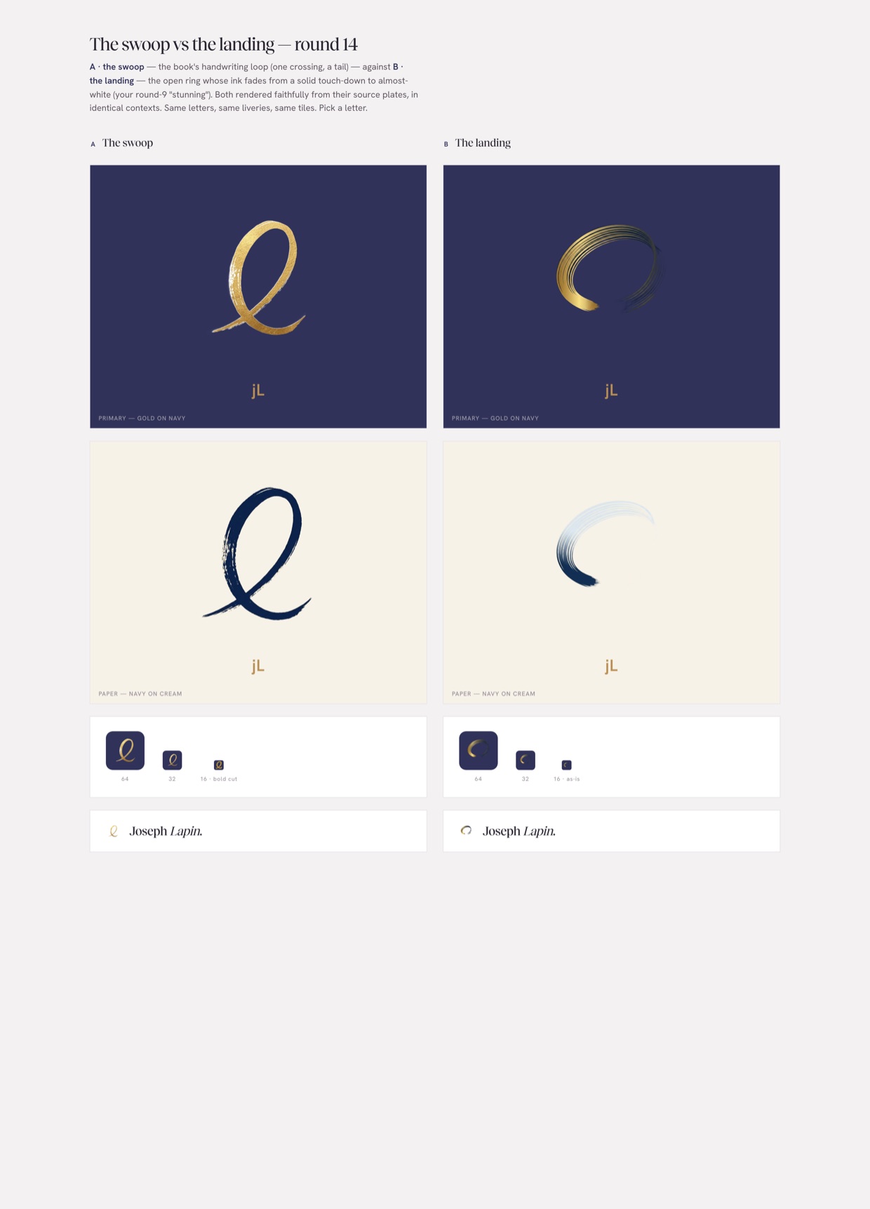
It proposed two directions. The whisper of smoke, led by the sushi mark. The thumbprint, led by the seal. Fifteen lab rounds later, the swoop on this site is the first direction, and the fourteenth round was a straight vote between the swoop and an open ring that fades at the landing.
I picked the swoop. The reason I gave went in the file.
Where taste lives after the project ends
Here is the part I got wrong for a year. The reactions were doing their job inside each project, and then the project shipped and they were gone. The next site started from zero, and I found myself rejecting the same three things again.
So the board has a destination now. Two, actually.
The brand folder. A why that repeats gets promoted into the criteria file that scores every page before it ships. “The visible landing is a requirement” started as a reaction to a circle. It is now criterion four, and the machine checks for it.
The design library. One folder that outlives every project. Each pack in it is the same three things: a written rule, real examples, and my reactions verbatim. Styles I have a taste about. Brands I admire as whole systems. Patterns I reuse. When a board or a lab closes, the refs and the reactions get copied in. And before the machine builds anything, it reads the pack first. “Build this in the quiet editorial style” now means something exact, because the file says ivory ground, one airbrushed gesture, colossal whitespace, and quotes me saying “unbelievably beautiful but kinda tough.”
The library has two verbs. Catalog, when something closes. Recall, before something starts. That is the whole maintenance.
The vocabulary: seventy-eight names the machine and I share
A year ago I had never heard of Memphis design, or neo-brutalism, or vaporwave. Now they are vocabulary. I can say “give me this in Memphis” and the machine and I mean the same thing, because a file in the library holds the recipe.
The first fifty came from a UX Planet roundup of design styles worth knowing for prompting. I filed it because it was exactly what I could feed the machine. The next twenty-one I added to cover what the roundup missed: the web and UI idioms, print and counterculture, image treatments. The last seven came in from my feed, mostly from a designer’s reel my thumb stopped on.
None of these are my taste. They are a shared language. A name graduates into the library proper only when I have reacted to real examples of it. Until then it is a recipe the machine can start from.
Here is the list. Each one is a name and a one-line recipe. The full file has the ingredients and what each is best for.
Classical and ornamental
- Neoclassical. Greco-Roman order, symmetry, refined elegance.
- Baroque. Opulent, emotional, dramatic. Thrives on excess.
- Filigree. Intricate, delicate ornamentation, usually gold or silver.
- Acanthus. Classical architectural ornament from acanthus foliage.
- Victorian. Grand, elaborate, deeply ornate nineteenth-century British.
- Art Deco. Sleek, geometric 1920s glamour. Variant: Deco Noir, the same language taken to night.
- Art Nouveau. Nature-inspired, fluid, highly decorative organic forms.
- Gothic. Medieval architecture plus dark romanticism.
Soft, light, and atmospheric
- Aurora. Northern-lights gradients, dreamy abstraction.
- Ethereal. Delicate, transcendent, weightless.
- Japandi. Japanese minimalism crossed with Scandinavian function.
- Wabi Sabi. The embrace of imperfection and impermanence.
- Light Academia. Soft, poetic, classical. Romanticizes knowledge.
- Shabby Chic. Vintage charm, distressed finishes, florals, pastels.
- Farmhouse and Cottagecore. Romanticized rural life and slow living.
- Bohemian. Artistic freedom, earthy charm, layered and global.
Retro and nostalgic
- Memphis. Bold, loud, unapologetically fun 1980s.
- Mid-Century. Form, function, organic simplicity, 1940s to 60s.
- Y2K. Late-90s cyber-futurism crossed with millennial pop.
- Neo Frutiger Aero. Y2K-revival glossy UI, bubble gradients.
- Synthwave. Retro-futuristic 1980s sci-fi, neon-lit.
- Vaporwave. Surreal, satirical consumerism critique.
- Pixel Art. Early video-game graphics nostalgia.
- Kitsch. Ironic bad taste, exaggerated sentimental pop.
- Pop Art. Mass media, advertising, comic books, built to grab attention.
Raw, bold, and structural
- Bauhaus. Functional, geometric, minimal.
- Brutalism. Raw, bold, purposefully unrefined.
- Neo-Brutalism. Brutalism’s cleaner, structured evolution.
- Utilitarian. Function first, clarity over aesthetics.
- Modular Typography. Type broken into grids and building blocks.
- Bento Box. Content in neatly organized block sections.
- Glassmorphism. Frosted-glass UI, transparency, blur, depth.
Tech and subculture
- Cybercore. High-tech hacker aesthetics and underground internet.
- Graffiti. Rebellious street culture, loud and expressive.
- Steampunk. Victorian aesthetics crossed with industrial machinery.
- Kawaii. Japanese cuteness, childlike and cheerful.
- Coquette. Ultra-feminine, flirty, vintage undertones.
Painterly and artistic technique
- Tenebrism. Dramatic lighting, intense light and dark.
- Pointillism. Images built from small dots of color.
- Surrealism. Dreamlike juxtapositions, broken logic.
- Mixed Media. Photography, illustration, and texture in one piece.
- Scrapbook. Handmade memory-collage, personal and layered.
- Conceptual Sketch. Rough hand-drawn ideation.
- Anthropomorphic. Human traits on objects, animals, and interfaces.
- Rebus. Communicates through symbols standing for words.
Thematic worlds
- Mystical Western. Cowboy westerns crossed with occult mysticism.
- South West and Wild West. American desert and cowboy culture. Variant: Desert Monoline, the desert drawn in one line weight.
- Dark Magic Academia. Gothic academia crossed with mysticism.
- Nautical. Sea life, ships, coastal living, fresh and orderly.
- Luxury Typography. Refined letterforms as the whole design.
Web and UI idioms
- Swiss, or International Typographic Style. The foundation of modern layout: objective clarity through the grid. The roundup’s biggest omission.
- Flat and Material Design. The post-2013 default. Know it mostly to deviate from it deliberately.
- Skeuomorphism. Digital surfaces imitating real materials.
- Neumorphism. Soft UI, elements extruded from the background. An accessibility risk at real contrast.
- Claymorphism. Chunky 3D clay-render illustration.
- Isometric Illustration. Thirty-degree parallel-projection worlds.
- FUI, the sci-fi HUD. Fictional interfaces from film.
Print and counterculture
- Risograph. Indie print, two or three spot colors, visible grain.
- Zine and Photocopy Punk. DIY xerox urgency. Variant: Skate Zine.
- Grunge Typography. David Carson’s broken type, illegibility as expression.
- Psychedelic Poster. 1960s Fillmore concert posters.
- Constructivism. Soviet avant-garde poster language.
- De Stijl. Mondrian’s reduction, primaries and black grid lines.
- Retro Americana. 1950s US advertising, mascots and script.
Image and illustration treatments
- Engraving and Etching. Vintage scientific linework, hatched and cross-hatched.
- Hand-Drawn Doodle. Naive ink line with visible humanity.
- Comic Strip. Sequential-panel cartooning.
- Ukiyo-e and Woodblock. Japanese print tradition, flat color planes.
- Duotone Photography. Photos mapped to two colors. Variant: Architectural Duotone.
- Cinematic Still. Frames that feel like film.
The named anti-style
- Corporate Flat. The flat-vector people with giant limbs and tiny heads, purple-coral gradients, floating shapes. Named so it can be banned by name. It reads as filler, and increasingly as AI slop.
From my feed
- Botanical Macro. Extreme-macro organic photography as the entire ground. The type whispers.
- Old Master Remix. Renaissance painting crops collided with modern editorial type.
- Cross Stitch Folk. Embroidery as a design language.
- Mosaic Type. Letterforms built from tesserae.
- Tokyo Print. Contemporary Japanese graphic design.
- Gzhel. Russian blue-on-white porcelain painting as identity.
- Hyper-Real 3D Character Design. Squishy, candy-colored rendered characters composited into real photographs. The expensive answer to flat filler.
Run it yourself
You do not need my folder to do this. You need a wall, a recorder, and the discipline to write down what you said.
- Write the brief in one line. What decision does this board unblock? If you cannot say, the board is premature. The strategy comes first.
- Hunt wide before you add your own. Fifteen to thirty real things, across categories, including five you expect to hate.
- React out loud and keep every word. Not a paraphrase. “This feels warm” and “I love the playful dreaminess of this” are different data, and only the second one is useful.
- Make the machine write the third column. For every love, what does it contribute? For every hate, what rule does it imply? Then four to six findings.
- Build a lab, not a revision. Five to seven complete versions of one decision, on real content. Pick by looking. Write down why.
- File the why somewhere it will be read again. A rule in a file loads every time. A rule in a conversation is gone tomorrow.
What the board is actually for
My homepage took about three hundred versions before one felt like mine. The figure on this site took eighteen attempts before I trusted it as me. When I show people the first landing page the machine made me, before any board existed, they laugh, because it looks like everyone’s landing page.
That is what taste without a record looks like. The average of the internet, every time.
The board is how the record gets made. My eye was always fine. The problem was that it left no trace, and the machine can only obey what it can read. Twenty minutes of talking to my phone in front of a wall of other people’s logos gave it something to read. A whisper of smoke, with a visible landing. Everything since has obeyed that sentence.
Questions I get asked
How do you train an AI on your taste?
You do not describe it. You sample it. Have the model gather twenty to thirty real references across categories, react to each one out loud, and have it record your exact words next to each image. Then it writes the analysis: what the loves share, what the hates rule out, and two to four directions worth testing. The reason behind each pick gets filed as a rule the model reads before it makes anything. Adjectives produce the average of the internet. Reactions produce you.
What should go on a mood board for AI design work?
Real things, not descriptions, across five categories: direct peers, out-of-category aspirations, artists who set a ceiling, adjacent media, and deliberate opposites. Fifteen to thirty of them. Include the ones you expect to hate, because hates are half the signal and the rejections turn into rules. Add your own finds with zero organizing. Then group the board by energy, not by source, so the tensions show, and end with an anti-wall of what is confirmed dead.
Why record reactions word for word instead of summarizing them?
Because the sentence is the asset and a paraphrase loses it. “That’s sick. It looks like a whisper of smoke” became the brief for the mark on this site. “Likes an organic brush feel” would have produced a hundred generic loops. The verbatim line carries the specificity a machine can obey. The machine’s job is the third column: turning “a whisper of smoke” into “tapered, breathing, atmospheric,” and turning “too death metal” into a rule against nested density.
What is the difference between a mood board and a lab?
A board finds the direction. A lab makes the decision. The board is wide: twenty or thirty references, reactions, a synthesis, and two to four named directions. A lab is narrow: five to seven complete versions of one decision, side by side, on real content, with exactly one variable changed. You pick by looking and write down why. Iterating a single comp toward a feeling is neither, and it is where every slow, reversed decision in my brand came from.
How do you keep an AI from forgetting your taste between projects?
File the why where it gets read again. Two places. A why that repeats gets promoted into the criteria file that scores every page before it ships. And a design library, one folder that outlives every project, holds a written rule, real examples, and your verbatim reactions for each style, brand, or pattern you have a taste about. Before the model builds anything, it reads the pack first. Two verbs keep it alive: catalog when something closes, recall before something starts.
One essay, every Sunday morning. The Human in the Loop.
— Joe
